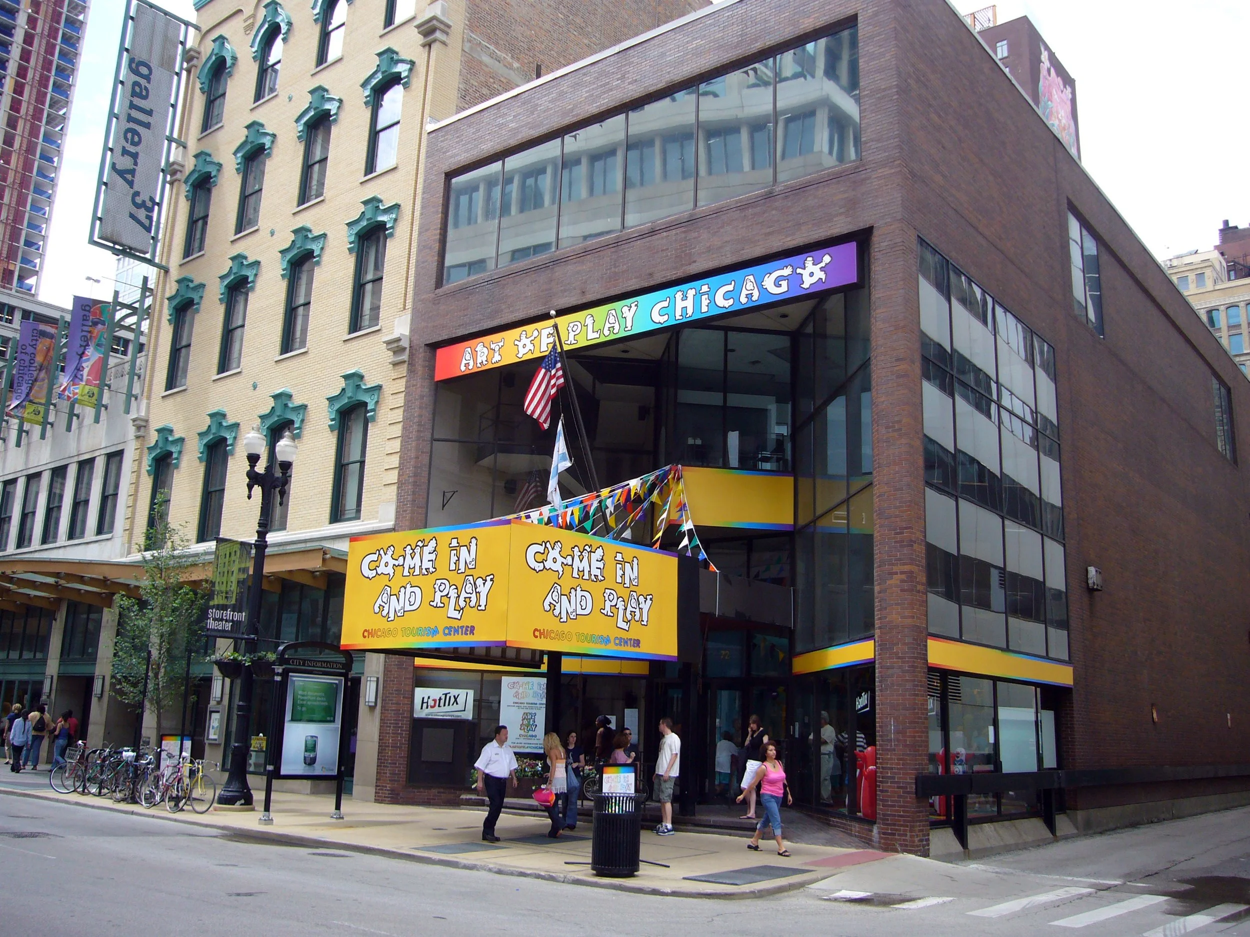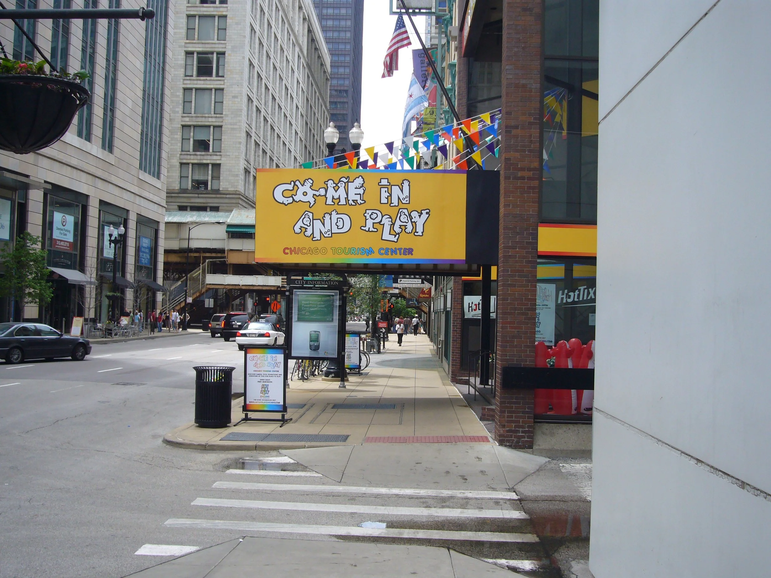
The Art of Play
City of Chicago

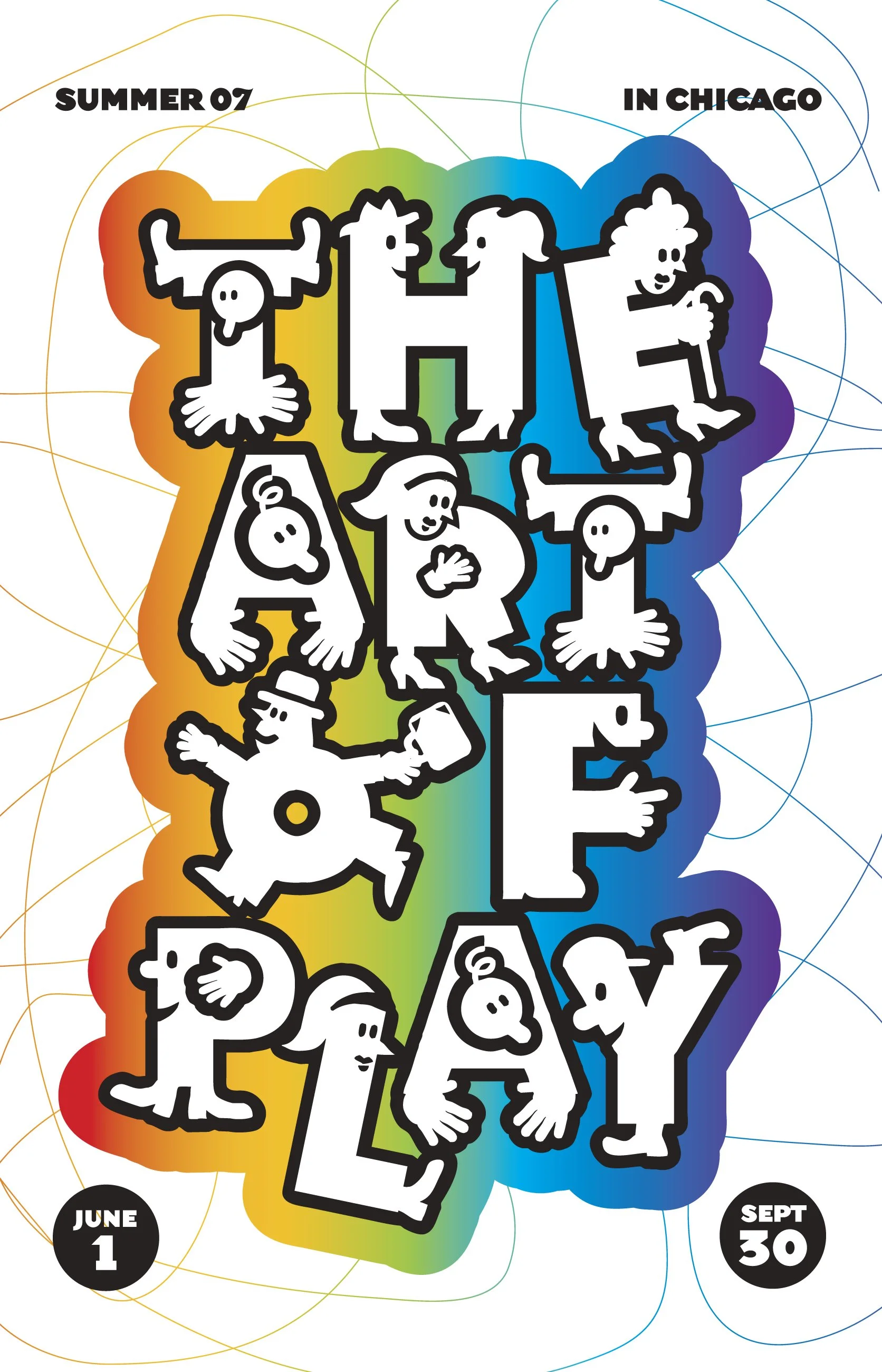
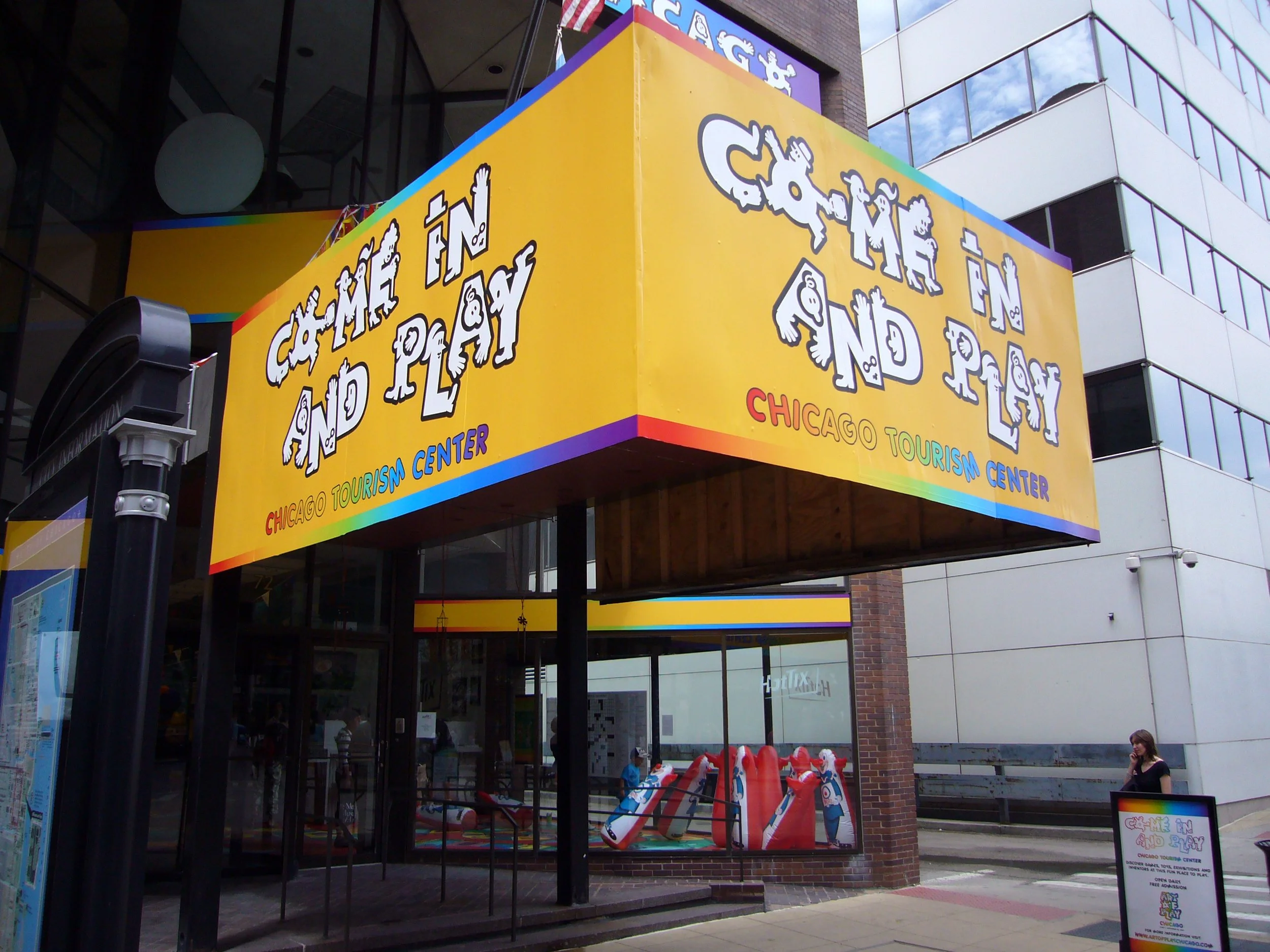
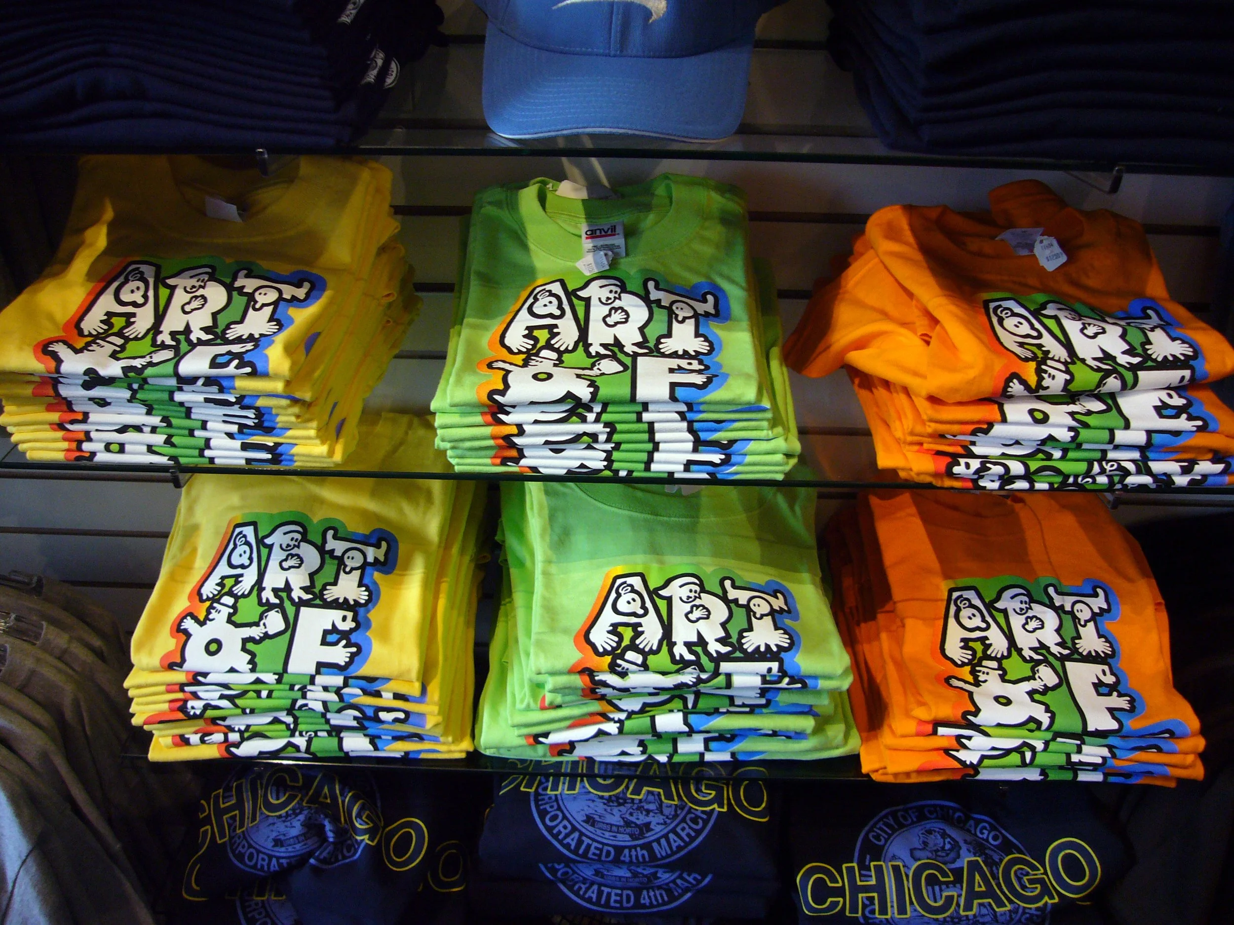
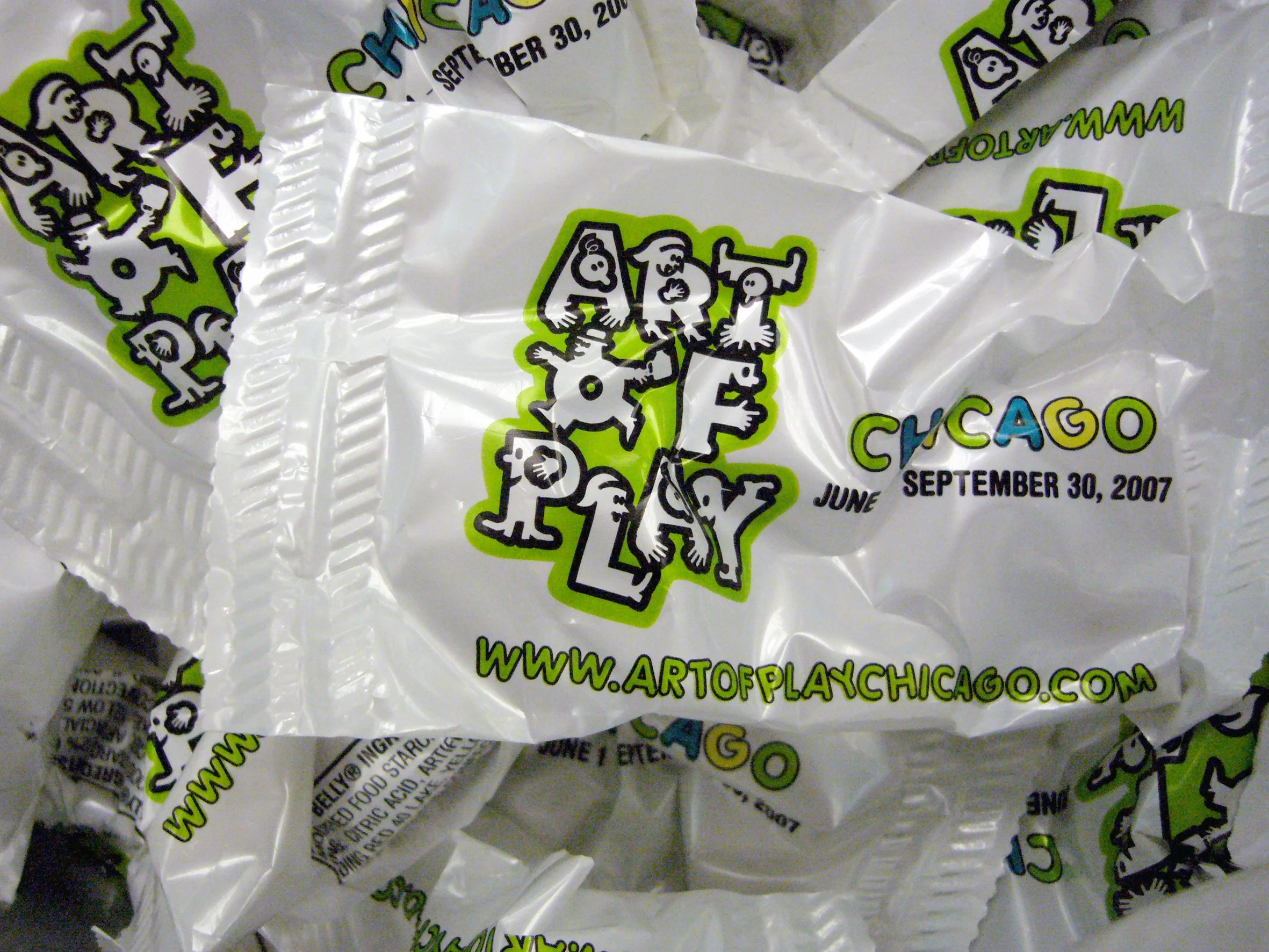
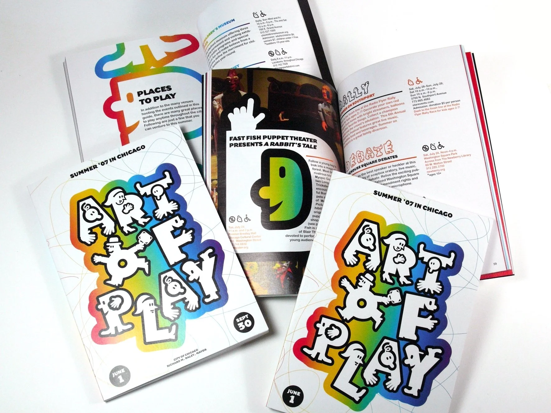
During the Summer, the City of Chicago proposes a large pallet of cultural events and activities under a common theme. In 2007, the theme was dedicated to The Art of Play in every possible form and to every type of public. The Department of Tourism commissioned me to design the logo that reflects playfulness and diversity.
”For me, the social dimension of the project was a driving force in my response. Indeed, Chicago is a city with a very large ethnic mix, and I wanted to find an identity that is representative of this cultural diversity and that can be appropriated by as many people as possible. I designed an alphabet of silhouettes which aims to represent citizens in their diversity and the playfulness in all its forms. The alphabet, by its great diversity of forms, allows a lot of variations on all information and communication media, far from a strict branding system.”